19 Jan 2017

Research Rationale

As I have most access to teenagers and young adults and they are the majority of K-pop listeners, my target group is to be people from the age range of 16-18 years old. By including a few young adults, I can expand my research and be able to see a variety of interests and opinions from a slightly wider age range for more accurate research. I will benefit from this age group also because they would have more experience with music magazines and would be more sure of their answers for my questions such as which music magazines are most popular right now and why they think that is as well as about what makes a magazine appealing. As I am focusing on a very different genre of music, since it comes from another country, I aim to ask both K-pop fans and non K-pop fans for their opinions on K-pop magazines, comparing them to British and American ones and seeing their preferences and why.


For my market research, I will create a survey that will include questions about music magazines they generally see, but also about what my target audience around me already know/do not know about K-pop. This would be interesting to see as it could tell me what K-pop fans & non K-pop fans know. I will then convert this information into graphs to conclude and clearly see any patterns in the answers I receive from my survey and to understand why people have responded the way that they have to help with the succession of my magazine. However because there are not many K-pop fans around me, this information may be difficult to decipher for my benefit.

I then aim to show them examples of western and K-pop magazines, asking them questions like what they first notice about the magazines and its effect and whether they like the magazine or not & why, comparing the two different styles of magazines from the east and west. I will also ask whether they prefer the style of western or K-pop magazines and why, to be able to keep the two styles distinct in preparation of mine.


For my research with my focus group, I want to include both K-pop fans and somebody who knows nothing about the genre.I would also like my focus group to react to a few K-pop music videos to give them a sense of what K-pop really is as this is a genre that most people do not know about. To get a variety of opinions. By including both fans and non-fans of this genre, I will be able to get their very first opinions on K-pop and the style of music it is, as well as what they liked and disliked about the music videos they will watch.

Once I have collected my research I will be able to know what differs from a western magazine and a K-pop one, helping me to make my magazine look more believable as a Korean-styled one. Not only that, but I will also find out more about what elements make a magazine eye-catching and successful.

16 Jan 2017

Exploring Typography

Searching online, I have found many different styles of fonts that music magazines both from the West and the East use; here is a mood board:
Whilst looking at the different mastheads of music magazines, I noticed that Western magazines' most-used feature colour is red, proven by the mastheads of Q, Rolling Stone, XXL, NME and so on. The other most popular colour to use is black because of its classic look with examples such as KERRANG!, Vibe, Mojo and DAZED. On the other hand, Eastern-Asian Kpop magazines often go for other softer colours, especially pink shown by Staraz, Kwave and 10asia+Star (and Bromide which changes their masthead's colour depending on the front cover's style and feature colours). However just like Western music magazines, Asian magazines like High Cut and KPOP LIFE also use black for a more classy look that can contrast with softer, lighter images that are common in Kpop magazines.

With the help of this mood board, I have found out that for my Kpop music magazine I can use a unique colour for my masthead and not challege Asian magazine conventions as long as it matches my front cover.

15 Jan 2017

Music Magazine Deconstruction

Here I have deconstructed two K-pop magazines' front covers, explaining what their key features are and their impacts on the reader.

Whilst looking at various different Korean magazines and deconstructing these two examples, I noticed how simplistic magazines in Korea can be and I absolutely love it. The minimalism of the front covers are very aesthetically pleasing as the cover photograph is not buried in texts and graphics and the overall style looks very neat. It also leaves a lot of what is featured in the magazine as a surprise which can be an advantage and a disadvantage; it would make the reader intrigued to look inside the magazine however can also not make them want to pick up the magazine in the first place. For example, if you saw your favorite artists' name in bold on a front cover, you are more likely to pick it up than have to guess &/or search for them in a magazine that does not feature their name on the cover.


These thoughts are making me wonder whether I should go for a more minimalist style for my front cover, contents and double page spread or a busier, more 'busier'-looking cover. Either one I choose, I know I have to keep this style consistent through my pages to keep them all connected to each other and look like they all come from the same magazine.


13 Jan 2017

Market Research: Magazine Examples

Here I have presented some key example of music magazines with styles & layouts that inspired me for my future magazine. I focused mainly on Kpop magazines as that is the music genre I chose to use for my music magazine however I did also present one western magazine to give me a more worldwide look on music magazines.


11 Jan 2017

Introduction: Brief Outline and Initial Ideas

In this video, I introduce some of my ideas for my music magazine before explaining my decided genre as well as what inspired me to focus on the genre of Kpop.
                                 

3 Oct 2016

PRELIM TASK: FINAL Products & Cohension


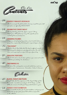
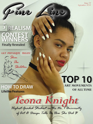
This is my final front cover and contents page. Overall, I think my preliminary task has been a success, especially since I have barely used the Photoshop software before this task. I wanted to make sure both the front cover and contents page connect and look like they belong in the same magazine, and with using the same feature colors of red, white and black. This also helped me keep the contents page look very neat. This links to the model I used for both pages as she is wearing the red lipstick and black choker to match the text colors with the eyedropper tool. I used the same, even less, fonts that I used on the front cover. I think the use of red for the subheadings on the contents page match well with the front cover's anchor, model and graphics I achieved this. I do feel like I could have been a little more creative with my contents page as it looks too much like a list. But I am very proud with how the cover page came out, as I can imagine it being sold on the shelves and looking professional.

So to conclude, I am very happy with my final products considering the amount of time I had to do them. I have gotten a lot more used to Photoshop, learning skills to not only do easy things, but also complex from experimenting with the software; I am excited to use it in the near future as well as carrying on posting on my blog.

PRELIM TASK: Cover Layout Decision - Photoshop

In this slideshow, I go over some of the decisions I made from start to finish, explaining why I did it and it's effect. I also receive feedback from my two teachers, Mrs Mottram & Mr Jones, and show how I respond to it.