31 Mar 2017
27 Mar 2017

25 Mar 2017

24 Mar 2017
CONTENTS PAGE: Image Choice

I chose this photo for my contents page because it is able to let me zoom in and crop it to focus on the space to the right of her for my articles. I successfully managed to get the orange-tinted outline of the model by taking the photo in a dark room with the flash on; this helps the image look more interesting and unique. The model's angle of gaze is strong even with the messy hair going over her face which I think is a nice detail. The dark and powerful eyes are juxtaposed by the elegant hand on her mouth and the pink sweater.
22 Mar 2017

20 Mar 2017
CONTENTS PAGE: Research/Deconstruction
In this post I will deconstruct two Korean magazine contents pages that I will use to model and inspire my contents page.

Firstly, I loved the image and it's positioning; model's head and body balances well with the negative space in front of him; the use of bricks as a background fills it. His angle of gaze and laid back body language adds mystery and wonder to him.
The use of sans-serif font gives it a modern look that links with the model's clothing as in Korea, fashion is very popular and well-thought of. The bolder, classic fonts as headers contrasting the captions is a pleasant layout and is simple.
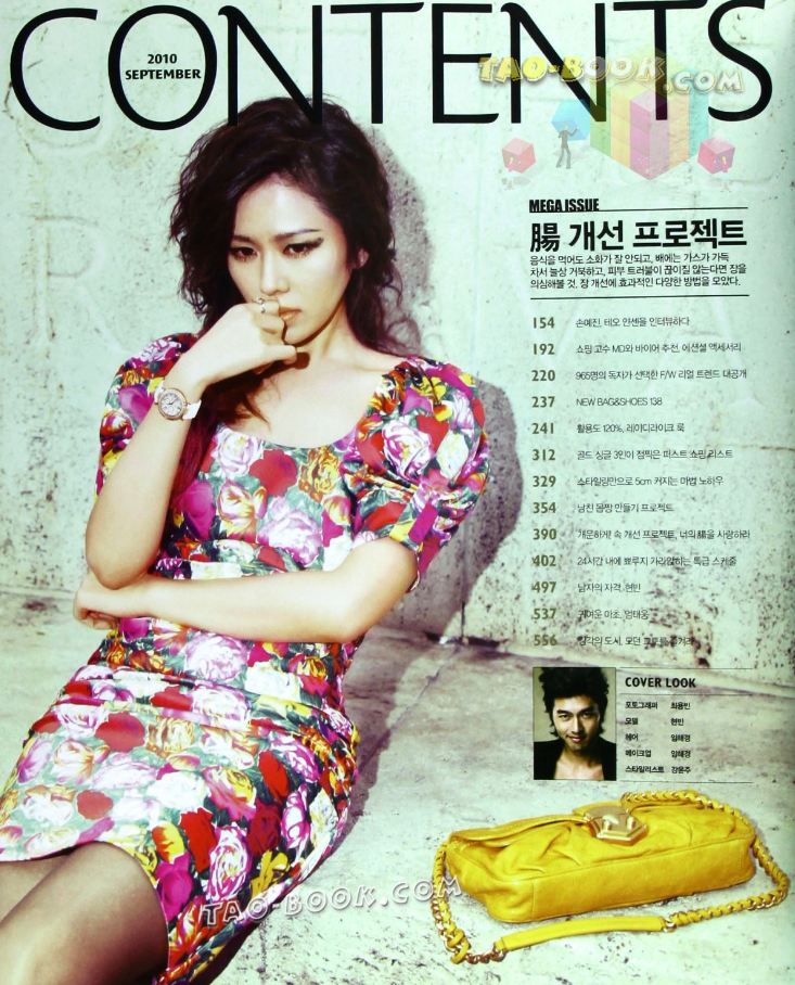
A lot like the first contents page I have shown, the model's angle of gaze is away, adding mystery however my model's angle of gaze will be at the reader; although the gaze is different, they both will look innocent and soft with a hand on the mouth.
I love the thin, simple text for the headers that match the page numbers; it lets you focus on the image more.
The introductory paragraph is a very cool idea and the separators organize the whole layout pleasantly.
18 Mar 2017
FRONT COVER: Feedback
In this Prezi, I present three young people from my target audience and their opinions also asking them on what I could improve on.
Subscribe to:
Posts (Atom)