3 Oct 2016

PRELIM TASK: FINAL Products & Cohension


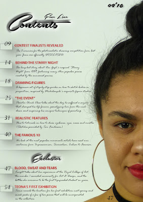
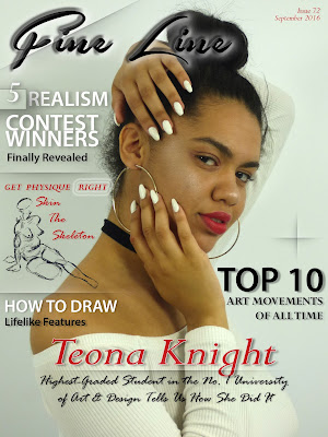
This is my final front cover and contents page. Overall, I think my preliminary task has been a success, especially since I have barely used the Photoshop software before this task. I wanted to make sure both the front cover and contents page connect and look like they belong in the same magazine, and with using the same feature colors of red, white and black. This also helped me keep the contents page look very neat. This links to the model I used for both pages as she is wearing the red lipstick and black choker to match the text colors with the eyedropper tool. I used the same, even less, fonts that I used on the front cover. I think the use of red for the subheadings on the contents page match well with the front cover's anchor, model and graphics I achieved this. I do feel like I could have been a little more creative with my contents page as it looks too much like a list. But I am very proud with how the cover page came out, as I can imagine it being sold on the shelves and looking professional.

So to conclude, I am very happy with my final products considering the amount of time I had to do them. I have gotten a lot more used to Photoshop, learning skills to not only do easy things, but also complex from experimenting with the software; I am excited to use it in the near future as well as carrying on posting on my blog.

PRELIM TASK: Cover Layout Decision - Photoshop

In this slideshow, I go over some of the decisions I made from start to finish, explaining why I did it and it's effect. I also receive feedback from my two teachers, Mrs Mottram & Mr Jones, and show how I respond to it.

27 Sept 2016

PRELIM TASK: Masthead Font Ideas

For the masthead, I wanted to carefully pick out a very particular font that will relate to the title 'Fine Line'. I used the website dafont.com to help me out as I know I can select different styles of fonts and choose from the huge variety they have there. 


I searched through the 'Brush' section under 'Script' and picked out these five fonts (top to bottom)
1. Beyond The Mountains
2. KG Life Is Messy
3. Guld Script
4. Airways
5. Southern Aire

This gave me something to start with so I could not use anything too rough or gritty looking like dry brush strokes since fine liners are very smooth, crossing off 'KG Life Is Messy'. 'Beyond The Mountains' looks too thick to be written by a fine liner so I marked that one off too. Also, since people not only draw, but write with fine liners I thought of choosing a font that looked handwritten yet was easy to read therefore no long tails or decorative lines around it. I wanted the font to have a elegant feel so I also decided not to use 'Airways'. 

I finally decided to choose the last font, 'Southern Aire', for its classic, handwritten finish to match the photograph and the rest of the text.

25 Sept 2016

PRELIM TASK: Final Shots - Why I Have Chosen Them

FRONT PAGE

To conclude, I chose this photograph for my cover page; I loved the pose and thought it was the most artistically effective one to represent traditional fine art poses for portraits as well as landscapes with the beautiful flow of her arms and hands since her hands look relaxed and softly placed; not gripping or violently clawing. It should make the reader ask themselves why she is posing this way and what this magazine may be about. The model's nails also give it a more feminine and elegant look to emphasize the fine art style as well as her top that matches. The model is not facing the viewer yet you can see just the right amount of her face and angle of gaze to be drawn in. The facial expression is just right for me, too, and emits a relaxed feel as the eyes are slightly smokey as well as the mouth hanging ever so slightly open. Because of the model's shoulder and elbow (of the arm around her head), this should give me a very interesting base for my text and layout, as I can use the form of her figure as a basis for what shall go where, giving me the right amount of negative space as well as filled space.


I also thought about using this photograph however found the lighting to be too dramatic for my type of magazine as well as unbalancing the highlights and shadows of the photo, giving me an uneven foundation for my texts and colors. However the first photo is very well-focused, the lighting is okay and should be excellent after editing it and I feel like I have successfully directed the model to express what I had in mind for my front cover page.

CONTENTS PAGE
As for my contents page, I decided to choose this photo because of its mystery. Because the model is covering half of her face, the viewer would wonder why that is and who this person is, wanting to read more about them in their exclusive cover story. Not only that, but the model's angle is different from the front cover photography as she is facing the viewer and making direct eye contact to gibe the impression that the model is telling the reader 'you, and only you'. Her slight smirk of invitation yet lowered brow gives a sense of power, in my opinion, and expresses strength; this very-particular facial expression contrasts the relaxed one in the front cover.


Here are two other photos from this final shoot.


23 Sept 2016

PRELIM TASK: Flat Plan - Contents Page


A key thing I have to remember when creating my contents page is that the cover & contents page must look like they come from the same magazine and link. 
I can do this by using the same fonts and feature colors as my front cover; therefore, I have decided to have the title 'contents' and '09'16' (month'year of the issue) in the same color and font as the magazine title. I then decided to have the page numbers in small boxes for a neat finish and beside them, a subheading of what those few pages will be about in my feature color, red. Underneath each subheading will be a sentence or two explaining, in black, in a little more detail about the magazine article.


Photograph-wise, I will have the same model as my front cover model in my contents and include one photo of her, perhaps playing around with hand movements like the front cover photo, linking the two pages together. By using one and only model in the front cover and contents page, I am emphasizing the importance of this person, making the reader want to know more about what is special about her

However, I have some negative space about her and thought of placing a quote by her from her exclusive cover story but I dislike this idea and may experiment with a photo of the model to cover this negative space.

This layout was inspired by this magazine's contents page, because of its simplistic design yet interesting layout, with no collaging and using one photo.  

PRELIM TASK: Flat Plan - Cover Page

This is a rough sketch of my front cover page of my college magazine, consisting a more detailed version of the photograph idea I had on my shot list (number 3) with one hand around the model's head and on her jaw with the other. These positions of the hands and arms will tell the reader that this magazine is more on the creative side rather than the model not posing with her hands in this way. The eyes are to be relaxed, inspired by past portrait paintings with the mouth ever so slightly open and loose to give the same impression as the eyes. The model is to be wearing a red lipstick which will be the feature color along with black and white to give the cover page a classic yet effective look. 

She will also wear a white off-shoulder top to expose some skin but not too much for a feminine look and to be able to gently blend with the white background; this will also give me the clean base for the anchor: the model's name to go on as well as a caption to explain what the issue includes about her. This layout of the anchor was inspired by this Rolling Stone issue that loved the classic look of and since the anchor was the first thing I saw.

 I also would like to include a graphic, perhaps a sketch or a few brush strokes that links with the text beside it to also tell the viewer that this magazine is about fine art. Along with that, I plan to add a '+' plus sign since plugs lure more viewers to become interested as the cover page will explain what is included to appeal to more and different types of viewers.
Not only did I choose to add detail to the photograph idea, but I also mindfully drafted out where I would like to place my text. I did this so I can see whether or not there would be too much negative space in a certain area, unbalancing the text and effecting the entire front cover. I have also thought about the color of each layer of text to be able to balance the colors out and make certain things such as my anchor stand out.


I finally labelled each piece of text and/or graphic that I plan to add with a number to represent the layers I would make in Photoshop and what order I will begin to place text in for a neater plan with something to always refer to.

21 Sept 2016

PRELIM TASK: Test Shots - Front Cover & Contents Page

On the first day of the shoot, I decided to take some test shots of different poses, using my shot lists as a guide. Whilst taking these photos, I chose to experiment with shot types, facial expressions, angle of gazes, poses (both hand and body) as well as angles and even lighting.


Here are a few other photos I took from the shoot that were directed by me merely inspired by portrait paintings.


PRELIM TASK: Model Consent Form


 My model that I am using for my preliminary task has signed a model consent form to give me permission to use and publish the photographs I plan to take of her along with me signing it, the date of the shoot and the location of it.

19 Sept 2016

PRELIM TASK: Shot List - Contents Page

For my contents page, I wanted to try something unique and use only one photograph, since most contents pages have quite a few pictures on it. I continued focusing on different artistic poses and after choosing sketch number 3 for my front cover image, I decided to have the model's hair in a high bun rather than down to be able to show off more of her face, neck and shoulders that are shown since she will be wearing a white, off-the-shoulder top to be able to neatly blend with the white background, causing her red lipstick to stand out even more.
1. Medium close-up, model's angle of gaze at reader and gives an inviting smirk as an introduction to her exclusives that will be featured in the last pages of the magazine (bottom of page). Simple photo to contrast front cover pose/position.

2. Medium close-up with three fingers over one eye, inspired by inventive poses. Angle of gaze with the exposed eye + smirk.

3. Medium close-up with hand covering half of face, expresses mystery through the pose. Along with angle of gaze with the expose eye + smirk. 
(Alike to number 2)

4. Side angle of medium close-up / close-up shot to emphasize on the facial feature of the model, creating mystery and making the reader want to know more about who she is.

5. Long shot of model on the floor, hand positions inspired by Jennifer Hudson's work; surrounded by blank white background like Jennifer Hudson's dark backgrounds.

6. Between medium close-up / close-up, hand on one cheek and model's angle of gaze is down for a peaceful, relaxed expression like portraits during the 1500s.

PRELIM TASK: Shot List - Cover Page


In this shot list, I have sketched out six possible photograph ideas for the front cover of my college magazine and annotated the shot type as well as the reasons behind each pose. I have chosen to take all of the photos in the media recording studio in front of a white background to keep it simple, classic and a clean base for all of my text.

Image result for renaissance paintings
1. (Extreme) Close-up to focus on the details of the face and expression. Model looking down to show relaxation and peace; represents the traditional relaxed facial expressions in renaissance paintings
Too close - no space for text.

2. Medium close-up to represent the portrait shot type of renaissance portraits and dramatically contrast the mis-en-scene of the white background with the feature color, red, of her lipstick.

Image result for renaissance paintings*3. Medium close-up, angle of gaze at viewer. Hair up to see more of face, hands and shoulders. Artistic pose inspired by Jennifer Hudson's photography - hand and arm poses.
                     
4. (Extreme) Close-up, model angle of gaze at readers' to pull reader in. Red lipstick stands out because of such as close shot type.
Too close - no space for text.

5. Long shot to surround entire model in white for a huge contrast of white and red trousers(?) OR huge contrast of model covered in body paint and white background, representing the one creative mind.
Too far / would have to cover entire model in paint?

6. Medium long shot (feet cut off), model sitting; legs crossed. Model covered in body paint? Known artistic pose for portrait-painting and modelling.
Too far / would have to cover entire model in paint?


My preferred photograph idea in my shot list is number 3 which has been inspired by Jennifer Hudson's fine art photography.


Hudson directs her models in traditional art poses, focusing mostly on arm & hand movements in a variety of different shot types, as seen in these images, as well as dressing them in delicate fabrics to give an antique, vintage vibe that I really like. Although my magazine is very modern, I still would like to incorporate an old-fashioned pose to connect the subject of the magazine with the photograph.

18 Sept 2016

PRELIM TASK: Reader Profile

This is Irina Alexandra, aged sixteen. She is a Greek fine art student from Athens, who is intrigued by the history of her country as well as its mythology. She attends college and is a very independent learner who is able to express herself better through her drawings. As well as studying fine art and history for her aspiring creative future career in art, she takes part in a weekly pottery class furthermore a writing club where she enjoys improving inventive skills. Since the age of 11, she has been constantly entering art competitions to be able to challenge herself, and has shelves stacked with medals, ribbons, trophies and certificates from winning previous ones with her incredible drawings. She hopes to travel all over to world alongside sketching and painting countries' people and landscapes to record all of her journeys. Irina loves spending her free-time alone in art exhibitions & galleries in hope of having one filled with her own work someday, libraries where she mostly reads about fine art as well as its history and at her local coffee shop in the early morning for her daily coffee and to doodle whatever and whoever she sees in one of her many sketchbooks. Irina has recently hit 11,000 followers on her Instagram account where she posts her artwork and follows other artists' with different work and styles.
Irina's favorite type of fine art is photo-realistic pencil drawings. She is constantly amazed at the amount of detail an artist can put in a portrait, therefore finds it fascinating. Irina tries to draw as much as she can to develop her talent and technique; she usually prefers to draw big-scale, at least A3 to be able to get as much detail in as she can. The longer she works on it, the happier she feels. However, she is not always pleased with the results. As a perfectionist, like most artists, she often feels untalented and dislikes her work. However with her art Instagram page, she has been able to gain support for her work and like it more. Irina is constantly getting comments, direct messages and emails telling her how much her exquisite talent at such a young age inspires younger people; this motivates her to practice more and keep going with her artistic journey in hope of one day being able to show the public her pieces in person at her very own exhibition.
The fact that an artist can imagine a piece in their mind, whether it may be a drawing, painting, sculpture, dance, piece of writing, recipe, photography or film, and bring it to life for the entire rest of the world to see astounds her, and Irina's goal is to copy that image in her head as indistinguishably as possible on paper with a pencil as well as encourage people at a young age to do the same.

13 Sept 2016

PRELIM TASK: Magazine Cover Conventions Analysis - Rolling Stone

Before working on my own student magazine for my preliminary task, I need to know what is placed onto a front cover and why. To answer these questions, I have deconstructed pieces of a magazine's front cover and evaluated each convection, explaining it's use and why the editor has chosen to use it, such as the anchor or the importance of text justification. I really enjoyed this task as it made me analyse the cover in extreme detail, learning how magazine companies make their front pages stand out for their target audience in so many different ways. This will help me carefully select different conventions for my magazine cover, as well as my contents page, to successfully appeal to my target audience.

12 Sept 2016

PRELIM TASK: INTRODUCTION + Initial Ideas

Welcome to FINE LINE! 
Here you'll find my personal posts for my Year 12 A-Level work. My goal is to think outside the box for unique ideas and bring them to life. I want to proudly express myself through my media work by creating new things that I have never made before whilst learning and having fun.

For my preliminary task, my brief is to create a front cover as well as a contents page for a college magazine, focusing on a certain topic or subject. My college magazine is to be about fine art as it is my personal passion, a subject I know a lot about which will help me with what to write on my front page and contents and I believe that creativity is a necessity; since this magazine is a college one, I can show the importance of it to students at a young age so they can use their imagination in their future.

My masthead is to be Fine Line since it obviously states the fine side of art, represents the finer liner pen an artist would use and also has a catchy sound to it because of the rhyme. My target audience's age would be around 16+, both girls and boys as my front cover and contents will include certain vocabulary from the fine art field that younger readers such as the age of 12 may not understand or know, such as different art movements like dadaism.
I plan for my front cover to consist of a medium close-up of a female model who will have an exclusive cover story in this issue, however as this magazine focuses on fine art, I intend to base the model's pose from my own knowledge of fine art & photography poses by sketching out a few different poses for my shot list and carefully selecting the ones I believe will work the best for both my magazine cover and contents page before I conclude to my flat plan. A few poses I first thought of were a few close-ups of the model covering half of her face for a mysterious look as well as a few long-shot standing, sitting and laying poses inspired by traditional Renaissance paintings and Greek statues. The look of my model shall be classy and elegant for a delicate vibe to represent the fine side of the art industry, contrasting from the graphic part.

The feature color will depend on what my model is wearing, whether that be a particular make-up or clothing piece, to make the image and text link as well as make the front cover pop. The fonts shall be inspired by classic cursive handwriting as well as graceful brush strokes to give the long-established fine art feel.


If you are interested in my media studies journey, please be sure to visit this page often to check my updates.
I truly hope you enjoy my blog and become a part of my little world.